Description
Freeze Dried overview
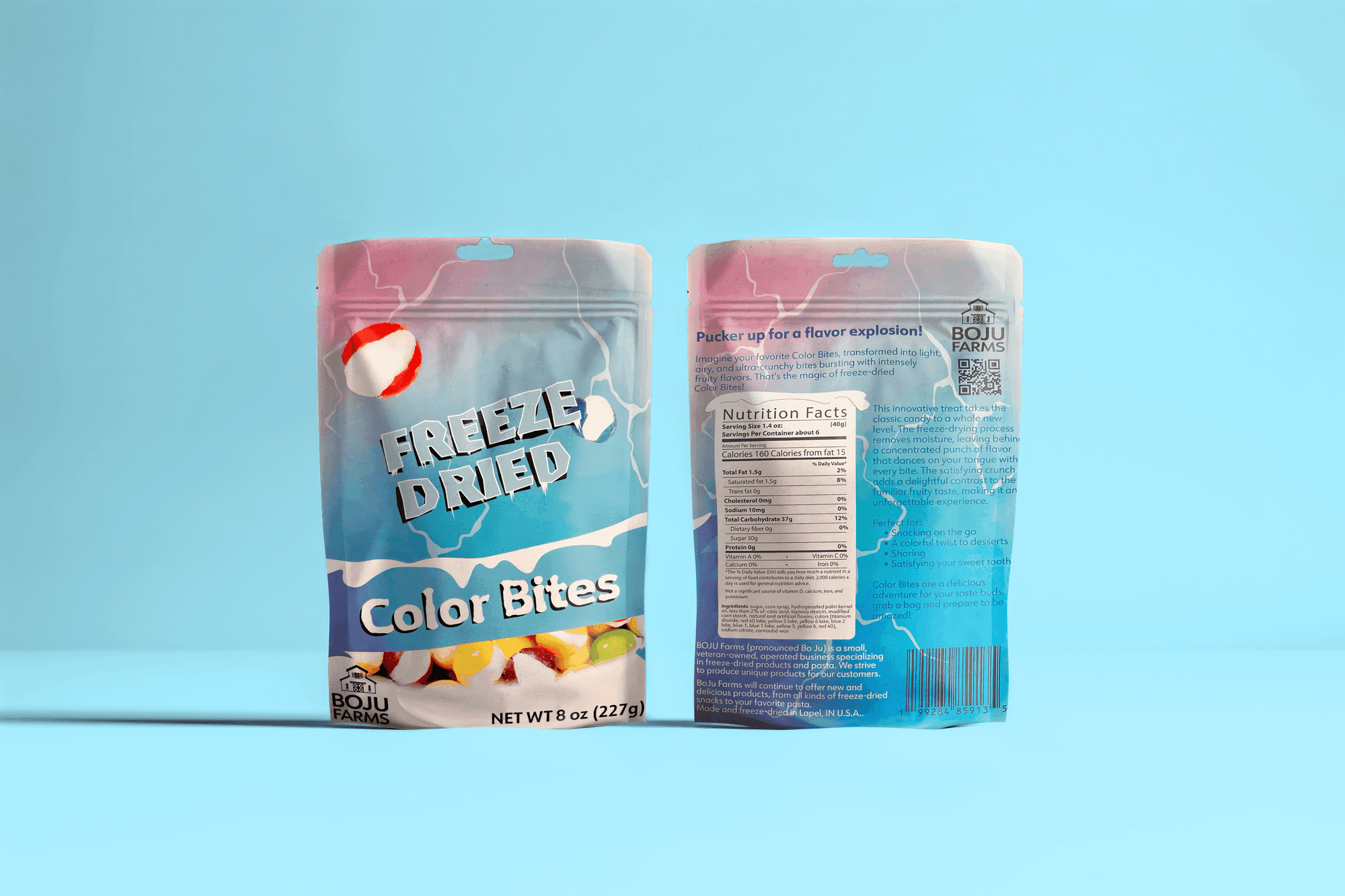
For this branding and packaging project, I designed a playful and vibrant identity for a freeze-dried candy brand. Inspired by the cool, frozen process of freeze-drying, I focused on using icy colors and dynamic typography to reflect the candy's light, airy texture. The packaging design features bold, modern elements that stand out on shelves, aiming to capture the fun and refreshing qualities of the product. This project showcases my ability to create engaging, eye-catching designs that connect with a youthful audience.
Concept
A candy brand with a cold, crisp personality
The brand direction took inspiration from the freeze-drying process itself. That idea guided the palette, shapes, and type treatment so the packaging feels crisp, lightweight, and modern.
Packaging
Bold shelf presence with a clean system underneath
The package design balances playful movement with clear structure. Strong hierarchy and repeating brand elements keep the line consistent across front-facing panels and supporting materials.
Result
A youthful identity that feels bright and memorable
The final project presents a brand system that can expand across product flavors while still feeling cohesive and visually distinct.
At a glance
Skills Branding / Product Design / Illustrator / Typography